

For my Research and Development subject I want to learn how to effectively write shaders to achieve a certain style for my game. Writing shaders has big a goal of mine for a long time, so I grabbed my chance and dove into the world of unlit shaders.
What is the purpose of this Research blog?
Like any other game developer, I appreciate when a game has a certain style that just fits and seems to work. A great aestethic takes into consideration the types of movement in the game, the framerate of the game and the story behind the game. Learning to program shaders seems to me like learning how to make a level fun. Once you know your tools and have a clear objective, there probably is not one way to do it. Just like what makes a game “fun” is what makes a style “pretty”. That being said, I want to learn how to use the tools(programming shaders) to be able to manipulate them to my liking.
My goal is to eventually apply this shader to a game I’m working on. The game in question is a linear runner, mobile game. It needs to look like a hand drawn picture, but it has to run at atleast 60 frames per second on an average(will be specified) mobile phone. I chose to re-create a toon-like shader because I have made games in the past that used a similair style. This style works because it doesn’t look bad or low effort, while being fairly light on a hardware level. That’s why it’s my goal to be able to write a shader that mimicks a style similair to most cartoon shaders. My eventual goal is not to imitate some style, but to understand the effects used in those shaders enough to be able to manipulate them in a way that suits my personal needs. I am not sure if the eventual cartoon shader I am thinking of right now is going to be the best option for my game. Maybe I can get away with a shader that does some more complex calculations, while maintaining a certain performance level. That would be great and would mean my game would look even better at the end.
Table of Contents
Chapter 1: Introduction
Chapter 2: Components
2.1: Outline
2.2: Toon shading
2.3: Light reflection
Chapter 3: Performance
Chapter 4: My preference
Chapter 5: Personal reflection
Resources
Chapter 1: Introduction
In the coming five weeks I’ll be trying to learn as much about shaders as I while actively appling my knowledge. As I don’t have a lot of knowledge about shaders yet, I will dedicate a decent time just watching videos, reading articles and documentation and trying new things while gaining a better grasp of developing shaders. I will have all the links of articles and videos in the resources at the bottom of this document. The language I will be programming the shader in is HLSL.
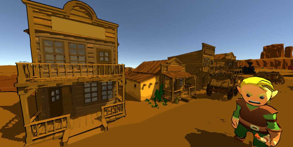
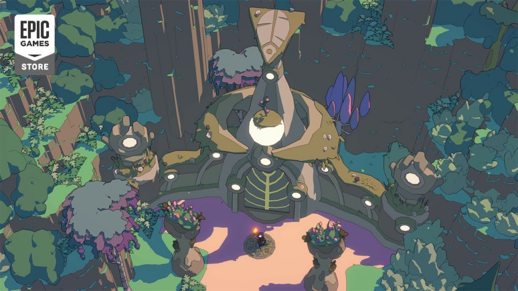
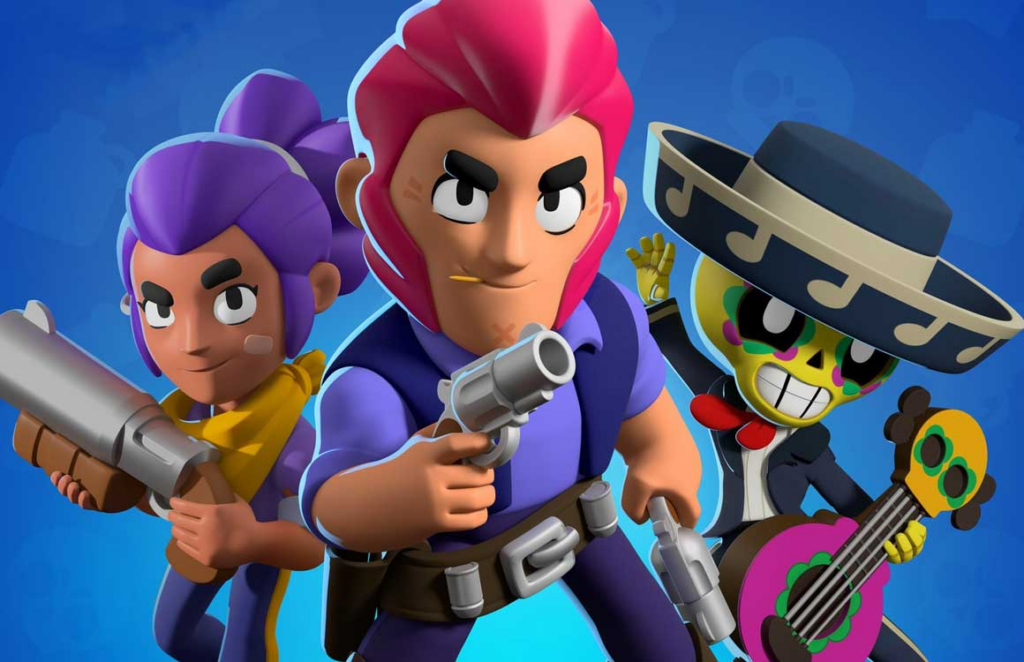
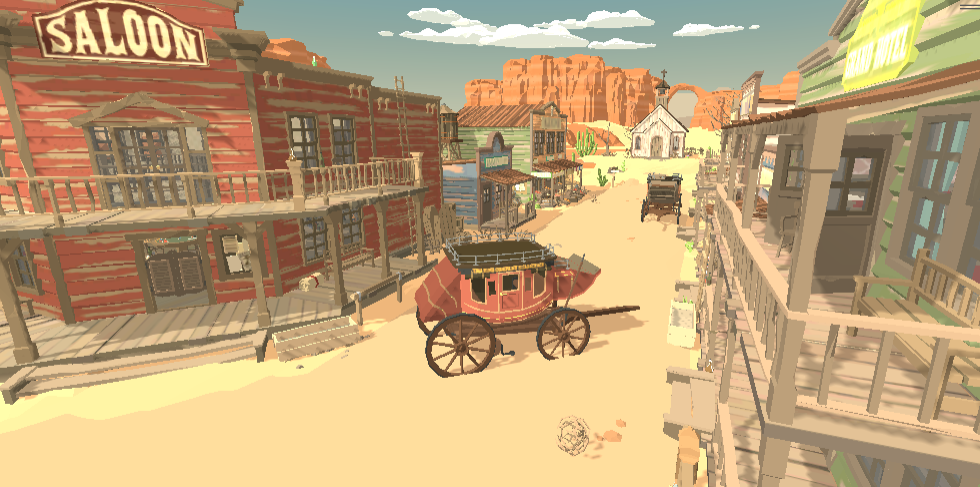
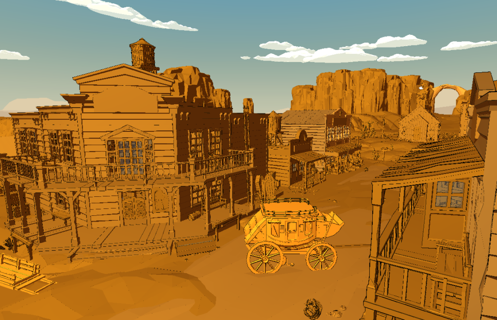
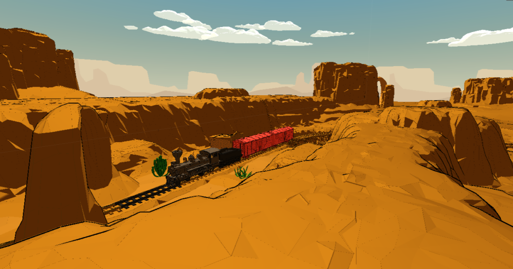
In this document I will be compiling my progress to making a toon shader. The toon shader I’m making is supposed to turn 3D objects into something that looks hand drawn, otherwise known as Cel shading. Examples to the effect I’m trying to achieve are games like Unexplored 2, Jet Set Radio, The legend of Zelda: Breath of the Wild, Brawlstars and Hades. All these games use some form of Cel shading but they are all clearly distinct in the look they achieve.
In chapter two I will be making the shader. To achieve my goal of making a toon shader, I will be splitting the task up into three main topics. The outline, toon shading and light reflection. For each topic I will be checking the progress and relevance on the subject by going through a cycle; think – make – check. In the think part I will be learning and following documentation and videos. I won’t be creating something new but I will try to get to know the working of the element in question. In the make part I will be trying to use the knowlegde I gained in the think part to make something that is close to the look I’m trying to achieve.
Performance is a big part of my goal, so the third chapter is about getting the best performance. Like in the second chapter, for each topic I will be explaining the best solution for the look I’m creating. The benchmark I’m going to maintain is 60 frames per second on my personal mobile phone.
After seeing what is possible when it comes to making shaders and knowing the limits the performance opposes, I will try to finialize the look I think looks best. This is the chapter where I will dedicate adjusting the shader I have been working on to look as best as possible.
The last chapter is my personal reflection on this experience so far. I will be compiling my thoughts throughout the process and rating my product as well. I will try to judge the product agianst some of the games I used as inspiration. This will be with the help of my fellow students.
Chapter 2: Components
The first steps I took to learning shaders is getting a basic understading of them as a whole. For this I used the tutorials made by Freya Holmer. She is a great resource for shading and understanding the most basic principles. With all her tutorials I try to actively follow them, so I try everthing out she does. This helps me get familiar with the environment. I will try to explain how shaders work in short, thanks to these videos.
Shaders are short scripts that give instructions to the rendering engine as to how an object interacts with the lighting in the scene. Not only do shaders decide the levels of lightness, color and darkness but they also are able to manipulate the vertices of a given object. This means they are capable of making objects move or make them appear moving.
2.1 Outline
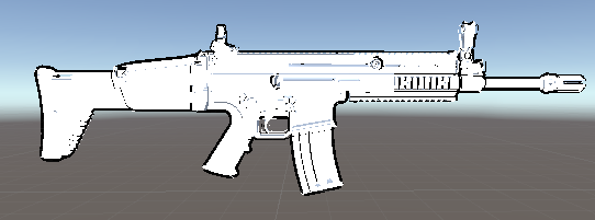
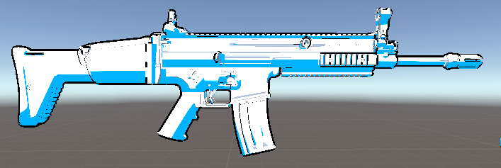
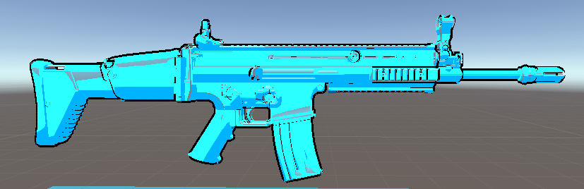
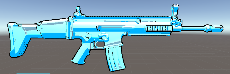
The outline is the black stroke around an object, otherwise known as edge detection effects. This stroke mimics the effect in cartoons and contributes to a large part of the cartoon look. I figured the outline would probably be the easiest to achieve, so that is the one I’m starting with.
Think
There are mutiple ways of achieving this result. I found a source online that listed most of these techniques(Ameye, 2021). I’ll be going through all of them, but not testing them all out in my own scene. There are about five ways to achieve an outline: Freznel effect outline, Vertex exclusion outline, Blurred buffer outline, Jump flood outline and with the Edge detection. Looking at the descriptions online I will explain each one and why I’ll be looking at using it or not.
Freznel effect outline: The freznel effect is technically not an outline. It is calculated using the angle of the objects normals. The more angle, the stronger the effect. The formula for this effect is: Out=pow((1.0−saturate(dot(N,V))),P).
Vertex exclusion outline: The vertex exclusion works by making a copy of the object, making it bigger and rendering it behind the main object. The cloned object is rendered in one color with gives the elusion of a outline. However, this method involves a lot of steps to pull of nicely. To make sure it works everytime, a normal map of every object has to be made because this technique is reliant of the correct direction of the normals.
Blurred buffer outline: The blurred buffer, like the name says, uses a blurring effect to make the outline of an object bigger. Combining this with the original object, you get an outline. Because it is generated using a blur effect, it works best as an outer glow or slim outline. But it is possible to scale up.
Jump flood outline: The jump flood outline is a great contender when it comes to looks. It grabs the silhouette of an object, takes the outer pixels and uses a couple passes to fill the outer lines. It fills the outline by passing through it, 1 pixel wide. After a couple of passes it fill the blank space in the outline to create a bigger line.
Edge detection outline: The edge detection outline uses the gaps between and within objects to check for an outer bound. Gaps in the depth, color and in the normals are used to calculate the edges. Using a sobel filter to clean the lines and edges up.
These are all techniques for outlining, but they are not all the same. The Jump flood outline for instance, only takes the outline of the object. But the extrusion exclusion outline even outlines depth within an object. I want to experiment with both of these methods. Out of these five methods, only two really speak to me; the jump flood method and the edge detection. The freznel effect is too soft and for that reason it is not really suitable for the effect(cartoony outline) I’m trying to achieve. The vertex exclusion outline looks good but needs a lot of setup and is generally harder to work with. The blurred buffer outline has the same problems as the freznel effect, I think this is not the application for it.
Make
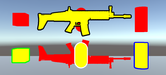
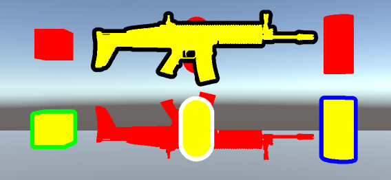
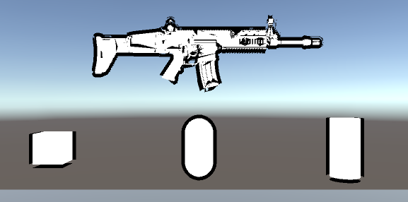
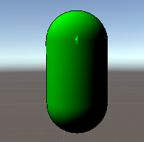
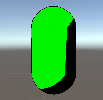
Now having decided which outline technique to use, we’ll be diving deeper into those methods. For now, I will be looking at the sharpness and overall look of the outline. I’ll be testing out these methods in the same scene with the same objects, some simple shapes and one complex. Also, I will be testing them out using two different Field Of View values; once in 50 and one 90. Why these numbers? An FOV of 50 gives a good look at the object without too much distortion. FOV on 90 because is tested because that’s what most games use.
The Jump Flood Outline
The jump flood outline works as following. With an silhouette of the object, the algorithm draws a imagininary line around it. After this, depending on the size of the stroke, the algorithm tries to fill the space outside the line. It does this in waves. Each pixel from the first outline draws a grid around it. It looks at the closest pixels and fills those in. Each of those new drawn pixels does the same. What you get is a very high quality line. This is also very easy to run as it responded very well to changes in size.
The Classic Normal Outline
This method is probably the easiest outline to understand. The method draws a outline along the normals of the object. By culling the front you can see the details of the object. This makes sure the outline is not just around the object, but also covers depth changes in the object itself.
Check
Out of these two, the classic outline if my favourite. The Jump Flood method has better lines, but I like the look of the classic normal outline. The Jump Flood method only outlines the edges. I like the outlines inside the object a lot, while I didn’t even think that was what I was looking for. Eventhough there are some inconsistencies, I really do like it more. The variation in line differences also adds to the look of the outline. Right now, it’s pretty simple. So I can improve and tune it more to my liking later in this document. The Jump Flood method also has some problems. It requires some more setup and as of now, the flipped UV’s of the rendered object still stain the buffer.
2.2 Toon shading
Toon shading, often reffered as cel shading, is a shading technique in which the rendering style is reminiscent of hand drawn cartoons. Where as most shaders would softly easy the line light and shadows create, the cartoon shader is recognizable by it’s hard lines. I will only be covering the shading and not the reflections or specular lighting, these will be covered in the next part.
Think
While searching for ways to realise the toon shading, I came across a couple of sites. The technique they used was not too far off each other. The basic priciple is this. When calculating lighting angles, the shader must calculate the smoothing in shadows. For this, the dot product is used to get a number between 1 and 0(and 0 and -1). If the light and object normal are parralel, the dot product will be 1. When they are perpendicular, the dot product is 0. This way the shader can assign a shadow strength according to the angle of the light. But when it comes to our toon shader we want the opposite. I want hard lines. So that the goal I’m going to achieve.
Make
Right now the dot product gives us realistic lighting and shadows, we don’t want that. So we’re going to make the dot product more “binairy”. If I can make the dot product either a 0 or 1 the effect should work.
With this line I make sure the dot product is ‘NdotL’ is a 1 or a 0.

As you can see the result is what I was looking for. The dot product doesn’t result in a smooth gradient of the shadow anymore and just cuts from light to dark.
This cut in the shadow is a little too hard. It makes for the aliasing to pop out and that kinda looks odd. So to smooth it out just a little I’ll be using smoothstep. Smoothstep is a function HLSL provides. It makes sure an otherwise linear line is smoothed out at the start and end. We use this functionality to just ever so slightly smooth the shadow line.
Check
I didn’t have enough time to go through everything I wanted in this part of the shader. I wanted to include some textures as shadows. The shadows not just being a filled in black void, but cross hatches to simulate a drawing. But this was the effect I was going for and having achieved this will suffice for now. Should I find more time down the line, I will still try to realise this feature.
2.3 Lighting
The last part to this shader to be completed is the lighting. I wanted to be able to bounce multiple sources of light off. I will try to add some specular highliting and rim lighting to finish the look. The specular highlighting is the effect that makes objects look wet or shiny. The rim lighting is the strong lighting effect around the edges of an object, when the light source is behind the object.
Think
First off, I have not made up my loss of time from last week. So I will be working against the clock again to get things done. I lost quite some time debugging and getting the lighting working. I’ve been checking tutorials and diving into some Freya tutorials again. Seeing as I want to improve the performance, I’ve been diving into documentation for the most part. When looking at my code, I’ve kept it as simple as possible. But having not tested it, I don’t know how much better it could be (or how it would perform on mobile for what it is right now).
Make
After falling back on a version that works, I’ll be trying to get some ambient lighting working. Ambient lighting is the light that has been bouncing off objects and off into the area again. This almost defines the hue of the object seeing as that is most of the light bouncing off. Without the ambient lighting the model looks almost flat. There are some shadows but these don’t allow a lot of detail in the model to be seen. To get ambient lighting to work in my case, I’ll be multiplying the color output in the fragment shader (and multiply again with the intensity variable). For now, this variable will have to be set manually, but in a better and more optimized shader, this would be done by getting the information out the scene. So dynamic ambient lighting is an option I’ll be looking at during the duration of this project.
As you can see the lighing in this example changed because of the ambient light filling the void that had no light to begin with. These shadows are not just a plain color, but are an addition to the color. Where I to change the base color to red, the shadows would become black again.
But it’s still missing more details. I want it to show some of the curvature of the object. The object for the most part is just a flat color. Would I have looked at my original goal, this would have been a great end to my tasks. But I find it to be a little flat. So I will be introducting some specular reflections. These reflections will show the reflection of an active light source. The high light points you see on bubbles for instance, is the specular reflection. This should add more of a depth effect, as the range of colors is increasing, combined with the fact that specular reflections are angle based. Depending on the angle, the specular reflections will move position, which also to effect to visualize depth.
I changed the lighting in the scene to be a blue-ish light. As you can see, there is a lot more range in the white spectrum. It adds a lot to the look and feel of the object now.
Check
Even though I didn’t want any gradients or gradient like aesthetic in my final product. But I might opt to leave it just like it is now. I find the result I got was going in the direction I want to go. It looks toony but the object still clearly shows a lot of detail. There are some points I can improve upon, like at the top, in the middle and at the bottom of the magazine; there are some spots that aren’t rendered properly because of the culling that is probably happening.
Next to that, I like the product I have right now. It’s far from perfect and needs some work to actually be usable in a game. But the style that I’m creating is in line with the ideas in my head. But I am still a little behind on schedule. This week was supposed to be exculsively performance. But seeing as I had some errors and had to write some scripts again from scratch, I tried my best to get a product that still works without compromising too much of my time. Earlier in this chapter I mentioned rim lighting. I still want to implement this but I have simply run out of time in this chapter. I will try to revisit this later in my chapter about preferences.
But I’ve had some great feedback this week. After I finished this chapter, I had a weekly check-up with my build and “Guild Masters”(my teachers). And they suggested to me that if I wanted to make a 3D runner game and actually use this shader in that game, it might be a good idea to make a testing scene that somewhat resembles or at least has some diversity in objects to test my shader. This didn’t really come to me before because I had a model with some variation in geometry. But that obviously doesn’t compare when we’re talking about a shader that should be applicable from a chest to a mountain. And it certainly won’t do it perfect instantly. Next to that, because the game I want to make is a runner, some motion would put it to the test as well. Objects might react very differently and weirdly by motion, so there is a whole chapter I probably could write about that. For the next chapter I want a couple of things in order to actually test my shader properly:
– I need a charater model that looks comparable to the one I’ll be making
– I need a new scene with some variation in object
– This scene will somewhat resemble a level from a runner game
– I need some objects that will move in different directions
– I need some objects that will obstruct each other in the view
The making of this will probably set me back a couple hours, but in the grand scheme of things it shouldn’t make a difference. This will save me time in the future, as these problems would pop of either way. So taking take of it now, while properly testing my shader seems like the best decision I can make now.
Chapter 3: Performance
Now that we have a product, there is a lot of room of improvement. Not only is the product not completed looks wise, but probably not on a technical standpoint. To achieve the effects I have right now, I used certain methods to get it done. But I haven’t spent a lot of time researching the most optimal way of getting the effect to work. In this chapter we’ll be looking at the best way I can optimize this shader. However, I will not be tweaking the shader to my liking. Even though it is not finished looks wise, it should remain for later in chapter four.
Think
I will be going technically in depth in this chapter so I want to split the shader up in parts. For each part I will try to optimize the part of code responsible for the effect it results in. For this chapter it is now more important than ever to have a solid test scene. Without a good test scene that tests multiple areas of performance, I will likely miss out on testing information could be detrimental to my product. I will use the feedback from the last check and try to apply it all on this chapter.
Make
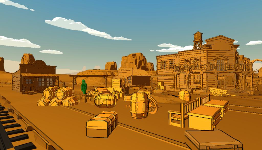
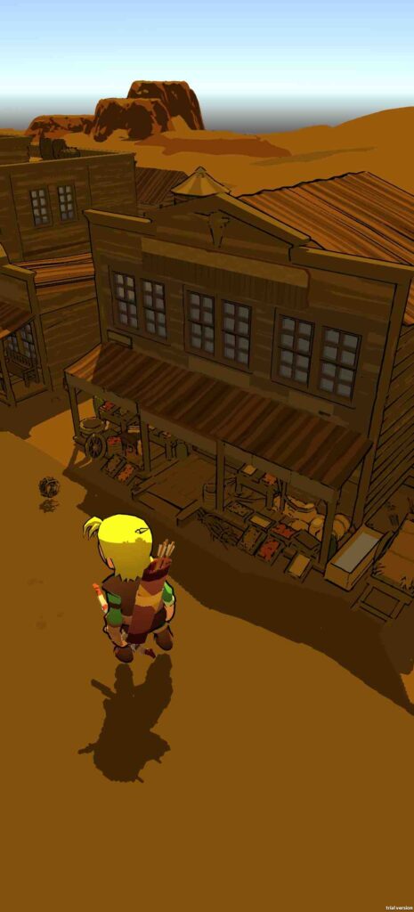
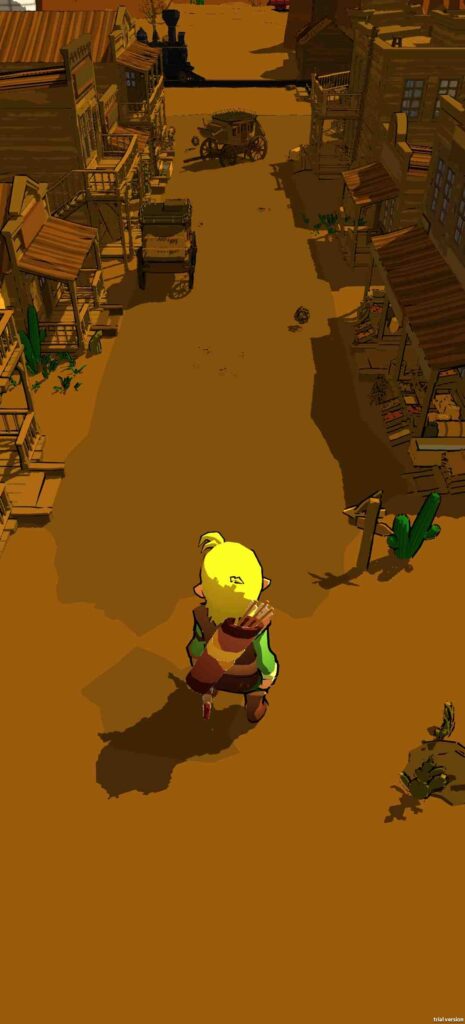
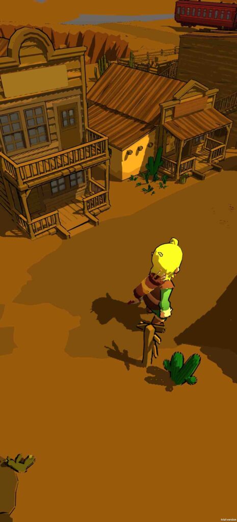
After a lot of trail and error I got a nice test scene which can be played, altough it is just to test the looks when moving. I’ve compiled this from an old project of mine but I still had to modify it to be able to run it. This test scene constists of a character model, terrain, buildings and many miscellaneous items. This way I will see how the shader react, from small objects to large objects. I also have a couple of asset shaders that I will use as a baseline. This baseline is the default look the object were meant to use.
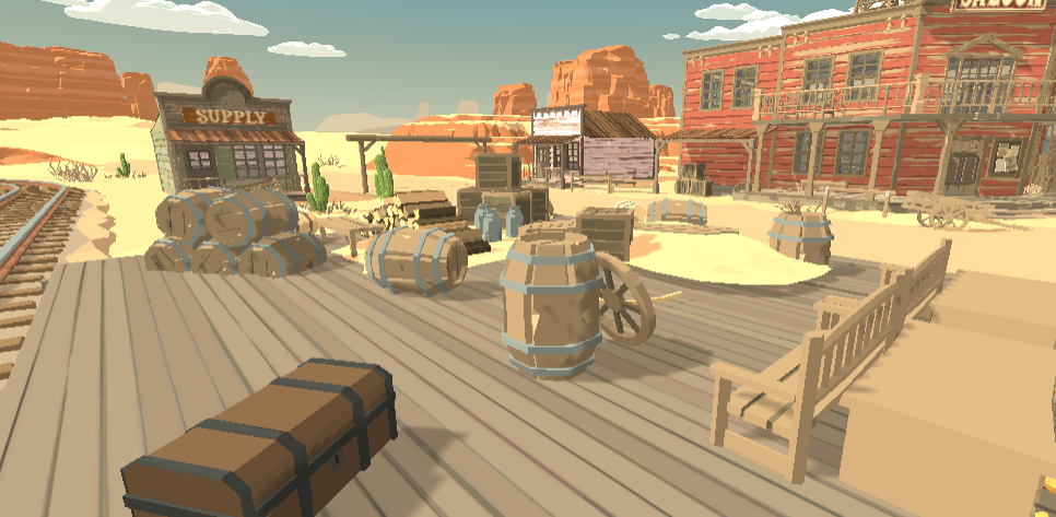
Now let’s look at our shader just thrown on there without actually tweaking the code. Keeping in mind, my goal was to be able to transform most ordinary looking 3D objects into a hand drawn style. I am still opting out of using textures, but this scene does utilize some texturing.
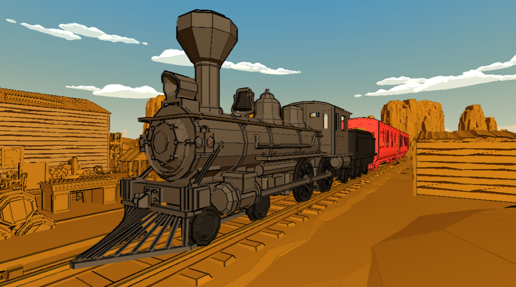
In these pictures there was as outlining used at 0.5 pixels. It can use some improvement for sure. But it is a solid foundation I can use to tool around to find my style. But there are some points of improvement when it comes to performance and general looks. As of now, I don’t cast any shadows. The shadows would make the look better but it is at a cost of performance. Next to that is the lighting. I was still working on a way to support mutiple light sources. After that I need to find a way to dynamically set the specular and ambient color. Right now it’s chosen for each scenario. But as this chapter is performance, we’ll be looking at the performance of this code and what I can do to improve it further.
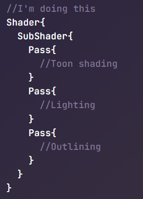
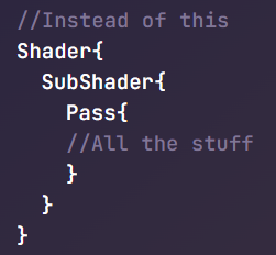
My shader is quite simple right now. Not a lot can be left out without it losing it’s main features. So I’ll be trying to improve the performance with all the code I have now. This will probably mean rearranging some lines to maybe distrubute some of the work load. Right now, the effects you see are all in one so called “pass” of the shader. Shaders have some ways of simplifying their code and making documents shorter. I could import some features from another script, but that would probably increase the overhead. What I did have in mind is splitting the code up in multiple passes. A pass is shader code that contains instructions for updating the render state before running the shader program.
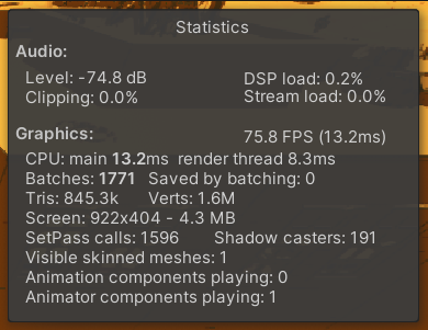
First of all, we need a baseline. I’ve tested this scene a couple hundred times and I can say that the FPS remains quite constant. This will help us later on with detecting pitfalls in the shader. For now these stats will be our reference. An average FPS of 75. Which is not bad. But this is a scene with nothing but scenery. There is no action or complicated calculations being done, so the FPS should be higher.
So I was looking for ways to improve my code as it is. But I couldn’t find a whole lot about it. I started looking if dividing a shader into multiple passes would increase the performance or reduce, but I couldn’t get a straight awnser. So I tested it for myself. My theory was that one shader probably requires some amount of power. If everything is made in one pass and some chances are done, the whole of the pass needs to be ran again. I thought, maybe if I split it up, every pass takes less power to run and re-running them will also reduce power constrains. I ran into more problems than I probably should have, but it worked out in the end. I tried the following: make one pass for the outline and one pass for the toon shading. As there is no support for lighting yet, the 3rd pass will have to wait.
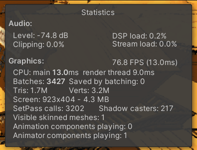
So I got to work and tested it out. I divided the shader into a pass for the outlining and a pass for the toon shading. I tested it out around 10 times for a reasonably consistant result. On average the shader with multiple passes got around three FPS more than without(the picture shows one but that frame a lot more was being rendered). Personally I wouldn’t say this has had any noticeable improvement. This difference in FPS is most likely just a coincidence of not having enough time to test it properly.
After that I started looking into the lighting method I used. At the moment I use a technique called Blinn-Phong. It is a superior version of the Phong technique which is used as a way of calculating lighting in a simulated condition. The way Blinn-Phong calculates the specular in a different way, using a so called halfway vector. I thought because calculating this halfway vector this would safe me performance, but after some research I found out I was wrong. The reflected direction in the calculating of the specular is a taxing calculation, as you must constantly calculate the dot product between the viewer and the reflected light from the light source.
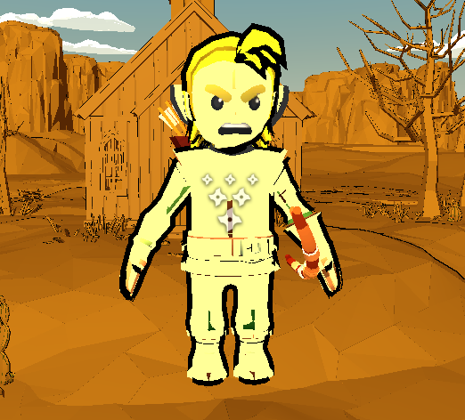
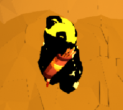
I tested my environment but I haven’t tried any character models yet. I found a old model from a previous project to test it on. As you can see it looks kind of off. That’s because there used to be a texture instead of a solid color. I haven’t taken the texture into account so far. Some artifacts are visible, but were I to use it in a game I would probably take a look at the normals as some of them are all over the place now.
In runtime some problems were uncovered. The irregularities in the outlining were found. It resembled something like a blob. This is because the outlining on different on multiple materials.
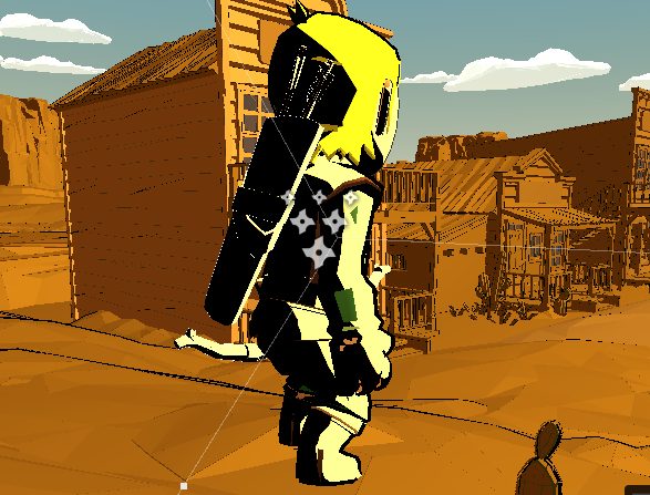
Next to that it is also a lot of tweaking with the camera and the shader. After some tweaking I got it to look more like this. This has been a lot of tweaking this week. After more tuning I got the character to look like this.
Check
This week was quite a lot of progress. After finishing my test scene this week, I started doing a lot of testing with the environment and character models. I found out my shader still needs a lot of tweaking. The outlining had some problems with the camera. After some tweaking it came out alright, but still had more in it i think. The feedback I got this week was also very useful. I wrote this chapter with performance in mind, but I did not touch on everything I needed to. The highest priority should be testing the product on a platform similair to what was proposed in the scope. I have a working android phone in which this could easily be tested. If not testing it on my phone, atleast test it in a way that resembles a phone. Ofcourse I can see a lot of flaws and problems on my big laptop screen. On a phone this might not always be the case. The problem is are objects still recognizable after the shader has been applied on a mobile phone screen. The outlining may improve visibility, but if not applied correctly it could end up doing the opposite. So as a way to keep track of the things that get the highest priority, this is my list of things to do from most important to least.
– Test this shader on a mobile device (atleast mobile screen)
– Tweak the shader to look better
– Add shadows (and possible half-toning)
– Add multiple light source support
– Add rimlighting
Would I have these worked out, I would call this project a complete succes.
Chapter 4: My Preference
Think
Building on the feedback I received last week, I will start by sharing my test results on a mobile device. This chapter was meant to be a playground for me to test out new looks for my shader. And that’s the priority I gave and will follow. In my use case it’s detrimental to test the shader on mobile device. But I have not yet made a build on my mobile phone. I have tested it on my phone to see if how it looked. And the visual quality the shader provides is good for mobile use. Small details are visible and the overall is what I was expecting.
Make
The same week after the last guild meeting I tried to implement half tones, but it didn’t seem to work right. I left it as is in code but still have some hope for getting it fixed before the summit. Right now I don’t know how much better or worst it will look dependant on how it fits the style. What I can do with the added code is adjust the size of the shadows.
I spent a lot of time tweaking and trying to get things to work. I didn’t have working shadows before, so a large part of the visual style was not even visible. I really struggled for a day or two before finally working it out. Halftone shading was one of the goals I had in mind which still has some problems. But I kept it aside as I didn’t want the overall look to be ruined by another error or glitch. Next to that I also wanted to use rim lighting. The code of it is also in my shader but currently doesn’t work. Eventough the halftone and rim lighting doesn’t work right now, it wouldn’t be too big of a problem to get it fixed for my own game.
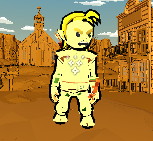
Just having the shadows cast on objects can make a big difference. It really felt like the whole scene was coming together. But still, the overall look just missed something. I like the look but I have seen better (ofcourse I’ve seen better, but even simple shaders have looked better). That’s when I started to look at other topics that might make a big difference in style. After some research I gave it a try to use the asset textures in combination with my current shader. I have to say, it really changed my view towards this shader. The simple randomness in some tones really make the scene look authentic. Ofcourse that is exclusive to this scene only. However, this is my final goal in styling the game I want to make.

The graphical fidelity on phone needs some improvement. But that will be the last thing I’ll be focusing on. Right now it’s playable but some objects have some odd behaviour when running the game. Even though the shader is basically complete, I still want to do some fine tuning. Next to that I’ll make a complete level to test for this project. For now, I’ll be sticking to the texturized look, as that is so far my favourite look. I have yet to add support for multiple light sources. I would have loved to have that in but because of some problems and time constraints I couldn’t get it in on time. Should I finish most of the work I have right now, I might revisit this before the summit, but certainly after.
I really like the outcome of this shader at the moment. I’ve made a couple of screen shots on my phone and the graphical fidelity is pretty good. There are still some spots that look kind of off but it will suffice for the purpose of this project. Some angles still seem to produce quite an odd result. That’s because of the way I draw the outlines. But it is this technique that gives it it’s unique look that I want. The last focus I have is making a good level that I can use at the summit.
Chapter 5: Personal reflection
After five weeks of working on this shader there is quite a lot to reflect on. I had a pretty rough start, which slowed my progress in the beginning. But after having some great feedback from the guild meetings I made changes that improved my work. I build a scene that resembles the game I want to make and made it playable for testing the looks while moving. The last weeks were detrimental to the final look I have now. Testing this out on a mobile game gave a clearer idea of the look and feel I want to create. So not only has this feedback been an eye opener in regards to this research paper but has also given me a new perspective to developing my own mobile game.
Though I missed a couple of features, the end result is still satifactory for me. I learned a lot about shaders in this short span of time. Next to that I really enjoyed making and researching this shader. I think the missed features would make my shader look even better. But I will have to develop that for my own game in the coming future.
Resources
Inspiration and ideas:
Sources:
Pixel-Perfect outline shaders for unity. (2018, 25 januari). https://www.videopoetics.com/tutorials/pixel-perfect-outline-shaders-unity/#how-outline-shaders-work
Golus, B. (2021, 15 december). The quest for very wide outlines – Ben Golus – medium. Medium. https://bgolus.medium.com/the-quest-for-very-wide-outlines-ba82ed442cd9
Unity Outline Shader tutorial at Roystan. (z.d.). https://roystan.net/articles/outline-shader/
Edge detection with Sobel filters. (2020, 31 augustus). jameshfisher.com. https://jameshfisher.com/2020/08/31/edge-detection-with-sobel-filters/
Technologies, U. (z.d.). Unity – Manual: Shaders. https://docs.unity3d.com/Manual/Shaders.html
LearnOpenGL – Advanced Lighting. (z.d.-b). https://learnopengl.com/Advanced-Lighting/Advanced-Lighting#:~:text=The%20only%20difference%20between%20Blinn,the%20view%20and%20reflection%20vector
Ameye, A. (2021, 1 augustus). 5 ways to draw an outline. https://ameye.dev/notes/rendering-outlines/